So, after all of the "splaining" I've been doing about mobile web, I thought I'd show you some great examples of different mobile efforts.
First, and foremost, this is how my blog looks from desktop to mobile:

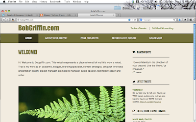
My own personal website looks like this:

I think that you get the importance of this. Who would want to look at the first version on a mobile phone? The mobile version is set up to take all of the content and scroll it for you with a shade of weight to its importance.
Obvisouly, if you have a top, left or right-sided navigation on your original site the mobile version will give you a scroll-down.
I just finished working on a website design for Marie Flahive, a water color artist in Western Massachusetts and the variance from desktop to tablet to smart phone has three different versions.
Below, you'll see her desktop version, which is beautiful (even if I say so myself) and not too complicated. But the area where things get dicey is the fact that she has many, many versions of water color artwork that is in many different formats (in terms of display) and also many different categories.

It is a very nice format for this type of website and it looks great in a large-scale, desktop portrayal, and yet, when you look at it on tablet and smart phone, if you can believe it — it looks even better! Her artwork is gorgeous, as you can see, but even at the smart phone level, it is very appealing.
Below you'll see the smart phone version of it, and even though I can't show you this here, this version in so many ways is better than the original.
I guess that this series of blogs has been about the fact that we have to
 think about web design in many different ways than we have in the past. I feel like it is yet another turning point for all of us. And it is happening silently, or without much warning.
As a group, we are all designers based upon our own background and culture. We bring that with us. We can't help it. But we have to adhere to certain design concepts that are unavoidable. As I said in one of my blogs, it's like the smoke after the volcano — it's unavoidable, and when we try to avoid it — we look silly, stupid and uninformed.